Understanding the Bootstrap Grid System(Part 1) | Tutorial - 4 HD
In this video tutorial we will understand the working of the bootstrap frameworks grid system. The grid system in bootstrap framework is one of the most important aspects of bootstrap for achieving the mobile responsive properties. The grid system helps divide the entire screen into 12 parts. This grid system consists of 3 main CSS class namely - container, row and columns. All the responsive behavior is achieved by wrapping the content inside the columns(col class applied to division or section or block level elements) which are wrapped inside rows which are ultimately wrapped inside the container. So the hierarchy goes as follows - container - rows - columns In bootstrap the responsive behavior is achieved by using media queries in CSS and we have 5 breakpoints for 5 standard devices - 1) Extra small devices (portrait phones, less than 576px) // No media query for `xs` since this is the default in Bootstrap 2) Small devices(sm) (landscape phones, 576px and up) @media (min-width: 576px) { ... } 3) Medium devices(md) (tablets, 768px and up) @media (min-width: 768px) { ... } 4) Large devices(lg) (desktops, 992px and up) @media (min-width: 992px) { ... } 5) Extra large devices(xl) (large desktops, 1200px and up) @media (min-width: 1200px) { ... } More information of grid system - https://getbootstrap.com/docs/4.1/layout/grid/ Full Web-Development Series Playlist - https://www.youtube.com/watch?v=ekxo4e7V7HM&list=PLIY8eNdw5tW85F-TuX65zYinmTnPUGzXw Simple Snippets Official Website - http://simplesnippets.tech/ Simple Snippets on Facebook - https://www.facebook.com/simplesnippets/ Simple Snippets on Instagram - https://www.instagram.com/simplesnippets/ Simple Snippets on Twitter - https://twitter.com/simplesnippet Simple Snippets Google Plus Page - https://plus.google.com/+SimpleSnippets Simple Snippets email ID - simplesnippetsinfo@gmail.com For More Technology News, Latest Updates and Blog articles visit our Official Website - http://simplesnippets.tech/ #bootstrap #bootstrapgrid #responsivewebsitedevelopment #webdevelopment #webdevelopmenttutoruals
 HD
HD HD
HD HD
HD HD
HD HD
HD HD
HD HD
HD HD
HD
 HD
HD HD
HD HD
HD HD
HD HD
HD HD
HD HD
HD HD
HD HD
HD HD
HD HD
HD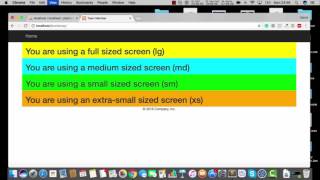 HD
HD HD
HD HD
HD HD
HD HD
HD HD
HD HD
HD HD
HD HD
HD HD
HD HD
HD HD
HD